In the last post, we saw that Westminster was the worst London borough for crime in terms of total overall reported incidents. We thought it would be interesting to look at how the incidence of different crime types varied across the boroughs, to find out where more serious crimes are prevalent in the city. That is what we are going to look at today.
Tools used:
- SQL
- R Studio
- MS Excel
First, I created a SQL query to obtain the table of interest:
SELECT
  borough,
  major_category,
  SUM(value)

FROM bigquery-public-data.london_crime.crime_by_lsoa

GROUP BY borough, major_category

ORDER BY borough
I uploaded the table to RStudio so that I could plot the incidence of crime by type for each borough. This is efficient, but admittedly the result does amount to visual overload:
faceted_plot <- ggplot(crime_data_2, aes(x = major_category, y = f0_)) +
                         geom_col(fill = "steelblue") +
                         facet_wrap(~ borough) +
                         labs(
                                             title = "Total reported crimes by category for each London borough during the period                                              2008–2016",
                                             x = "Crime Category",
                                             y = "Reported Crimes"
                                         ) +
                         coord_flip() +

                         theme_minimal()

faceted_plot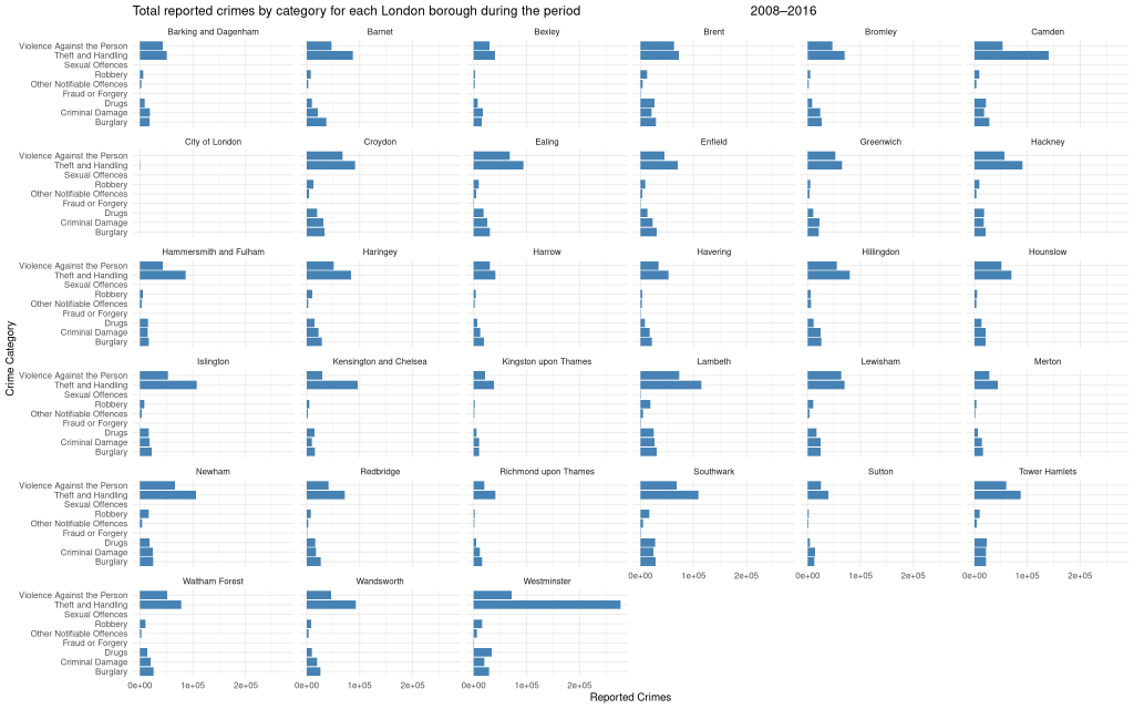
It is very difficult to read the labels. Westminster sticks out of course, with its Theft and Handling column. Looking at all the results in unison, it would appear to support the theory that increased incidence of theft and handling offenses are what make Westminster the worst overall borough for crime.
What about other crime categories though? We were interested in looking at more dangerous and violent crimes, to identify the least safe areas of the city. To facilitate the comparison, we can filter the data to only include the worst offending boroughs. Let’s take the worst 10. For the period 2008 – 2016, these were identified in the previous analysis as:
- Westminster
- Lambeth
- Southwark
- Camden
- Newham
- Croydon
- Ealing
- Islington
- Tower Hamlets
- Brent
We start by loading up the dplyr package:
install.packages("dplyr")
library(dplyr)

ggplot(filter(crime_data_2, borough %in% c("Westminster", "Lambeth", "Southwark", "Camden", "Newham", "Croydon", "Ealing",
                                           "Islington", "Tower Hamlets", "Brent")),
       aes(x = major_category, y = f0_)) +
  geom_col(fill = "steelblue") +
  facet_wrap(~ borough, scales = "free_x") +
  coord_flip() +
  labs(
    title = "Selected boroughs: reported crimes by category (2008–2016)",
    x = "Crime Category",
    y = "Reported Crimes"
  ) +
  theme_minimal()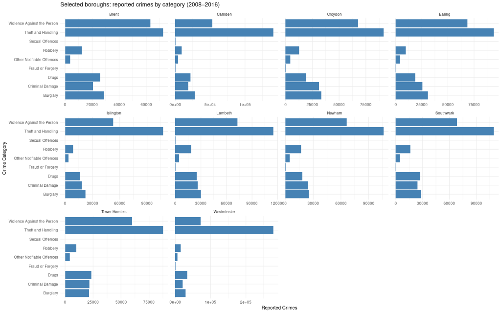
That is a big improvement. I think coord_flip(), which makes the bars horizontal, really helps in terms of making the labels more readable on the y-axis.
What do we get from this? It does not look there are any particularly striking differences between the boroughs in terms of incidence of violent crime. Theft and handling is pretty even across the top 10 as well. Interesting to note that Sexual Offences actually appear to be very rare, my supposition would be that this is because rape and sexual assaults are grouped with the general violent crime category.
To finish, then, let’s make some charts to determine which of the boroughs is the most violent.
So Lambeth is actually worse for violent crime than Westminster, but not by that much. To finish, here is the chart with just the top 10:
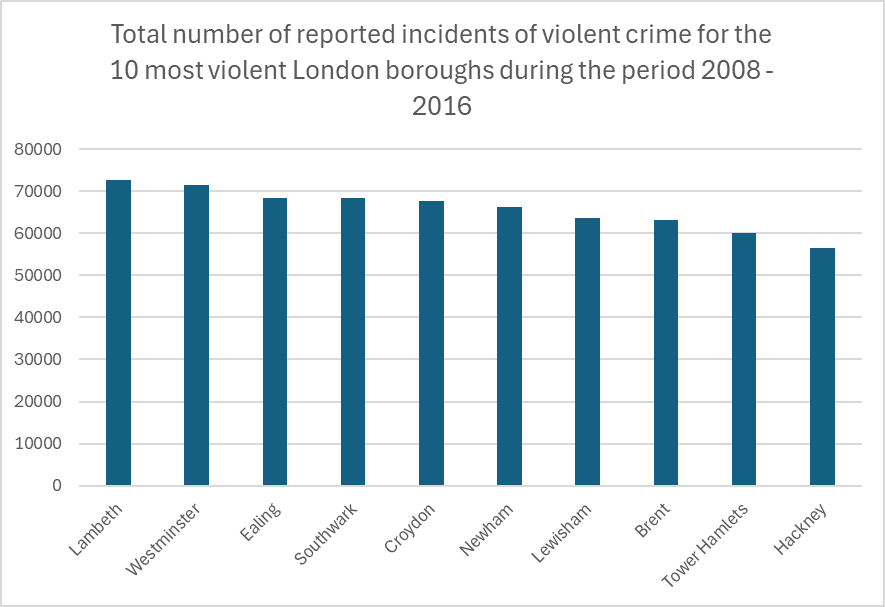
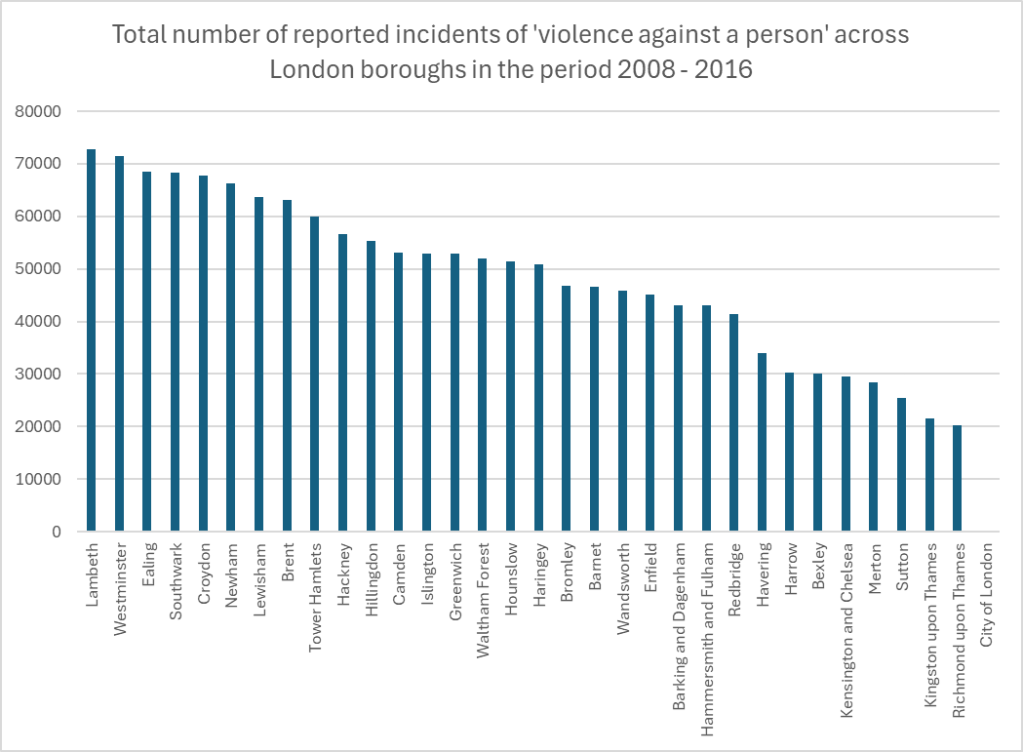
Lambeth at no.1 had a total number of reported violent incidents of 72726, while Hackney at no.10 had 56584. Perhaps a more startling statistic is that, given the total number of violent incidents reported across the city, there were on average 474 violent incidents reported each day during the 9 year period. Now I know London is big, but come on. Why can’t people be nice?
Also interesting is that the top 10 worst boroughs for overall reported incidents are not the same as the top 10 worst boroughs for violent crimes. Camden, one of the worst boorughs for overall crime, is not amongst the most violent. Neither is Islington. On the other hand, violent crime was bad enough in Hackney and Lewisham to rank them amongst the 10 most violent.

Leave a comment