I am from London, so I thought it might be interesting to find out how safe I am (well not really, because the data are quite out of date). Anyway.
Tools Used:
- SQL
- RStudio
- MS Excel
I extracted the data from the publicly available datasets on Google’s BigQuery with SQL. Once I had tabulated the data of interest, I downloaded it as a .csv and brought it into RStudio to create my visualizations.
The first question that came to mind was, which boroughs are associated with the worst crime rates? It would also be interesting to look at how crime rates have varied over time.
There are 33 official London boroughs (or 32 + City of London if you want to be pedantic).
Here is the query I used to get the table:
SELECT
  year,
  borough,
  SUM(value) AS total_crimes
FROM bigquery-public-data.london_crime.crime_by_lsoa
GROUP BY
  year, borough
ORDER BY
   borough, year
This returns a table with the total number of reported crimes for each borough, for each year 2008 – 2016.
The next step was to upload the table to RStudio to create my viz. I would of course be using the ggplot2 package:
install.packages("dplyr")
install.packages("ggplot2")
library(dplyr)
library(ggplot2)
Next I uploaded the crime data. For my first visualization, I wanted to find out which boroughs had the worst vs. best (or ‘least bad’) levels of crime. I would use a bar chart for this purpose:
crime_data <- read.csv("london_crime_by_borough.csv")
colnames(crime_data)

total_crimes_by_borough <- crime_data %>%
     group_by(borough) %>%
     summarise(total = sum(total_crimes, na.rm = TRUE)) %>%
     arrange(desc(total))

gplot(total_crimes_by_borough, aes(x = reorder(borough, -total), y = total)) +
          geom_bar(stat = "identity", fill = "steelblue") +
          labs(
                  title = "Total Reported Crimes by Borough (2008–2016)",
                  x = "Borough",
                  y = "Total Crimes"
              ) +
          theme_minimal() +
          theme(axis.text.x = element_text(angle = 45, hjust = 1))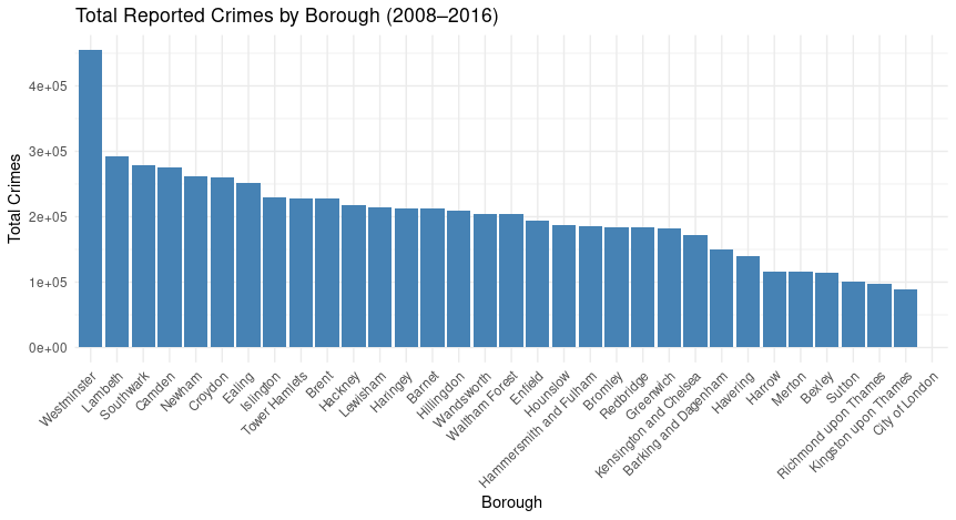
The reorder method is great here for arranging the bars in descending order of size, which makes comparison an awful lot easier. Not too surprising that City of London had the least number of reported crimes (although, maybe it is a little surprising, given the data starts in the midst of the financial crisis. If the fraud’s big enough, and the suits are smart enough, perhaps it doesn’t count :P).
Westminster then is by far the worst borough for crime. I decide I want to look into this further, but first, I wanted to answer the question about whether crime has got better or worse in London’s boroughs over time. Using the facet_wrap method, I efficiently created a plot for each borough with my original london_crime_by_borough table of values:
  ggplot(crime_data, aes(x = year, y = total_crimes)) +
                         geom_line(color = "darkred") +
                         facet_wrap(~ borough) +
                         labs(
                                             title = "Reported Crimes Over Time by Borough (2008–2016)",
                                             x = "Year",
                                             y = "Reported Crimes"
                                         ) +
                         theme_minimal() +
                         theme(
                             axis.text.x = element_blank(),
                             axis.ticks.x = element_blank()
                         )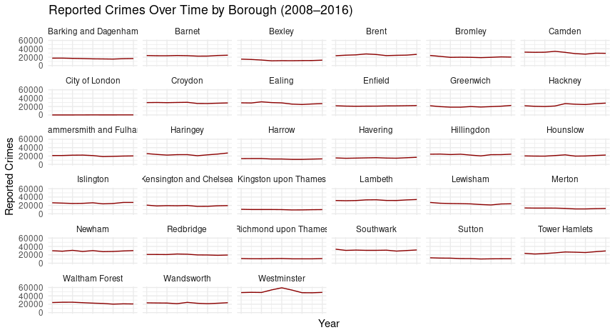
So crime rates for all boroughs were pretty constant over the nine year period, with the exception of Westminster, when it got a bit worse in the middle for some reason. (Also, it looks like Tower Hamlets has been on a bit of a slow decline. Shame).
Note that the final section theme(axis.text.x…) was used to remove the year labels from the x axis on each plot. This was because the labels were very cluttered and it just looked like a mess. I think it is evident enough how things changed (ok, did not change) over time.
Why is Westminster the worst borough for crime?
It is important to note that, we conceptualized our crime rate as the total number of reported crimes in any year. It is not to say that Westminster is particularly unpleasant or dangerous. It could be that there is just a high volume of petty crime in the area.
The place is known as a bit of a tourist hotspot, and it hosts a thriving nightlife scene. As such, there is generally a higher footfall through the area, so it follows that the results for the reported crime statistics might be somewhat negatively skewed. Crime is something that people perpetrate against other people: more people = more crime.
I created a SQL query to examine the number of reported crimes for Westminster by type:
SELECT
  major_category,
  SUM(value) AS total_crimes
FROM bigquery-public-data.london_crime.crime_by_lsoa

WHERE borough = 'Westminster'

GROUP BY
  major_category
ORDER BY
  total_crimes DESC;
With the query results I then made a quick bar chart with Excel:
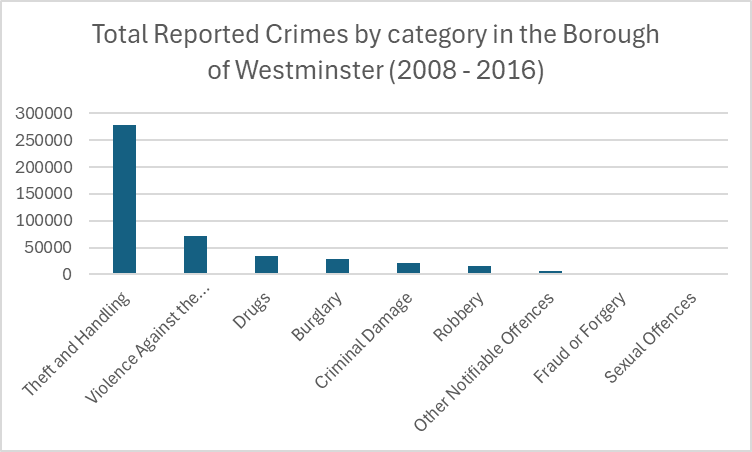
So, the total number of reported crimes was driven heavily by theft and handling offenses.
Let’s look at how reported theft and handling incidents compared for each of the other 32 boroughs. I made a new query with SQL and used Excel again to make a quick chart:
SELECT
  borough,
  SUM(value) AS total_crimes
FROM bigquery-public-data.london_crime.crime_by_lsoa

WHERE major_category = 'Theft and Handling'

GROUP BY
  borough
ORDER BY
  total_crimes DESC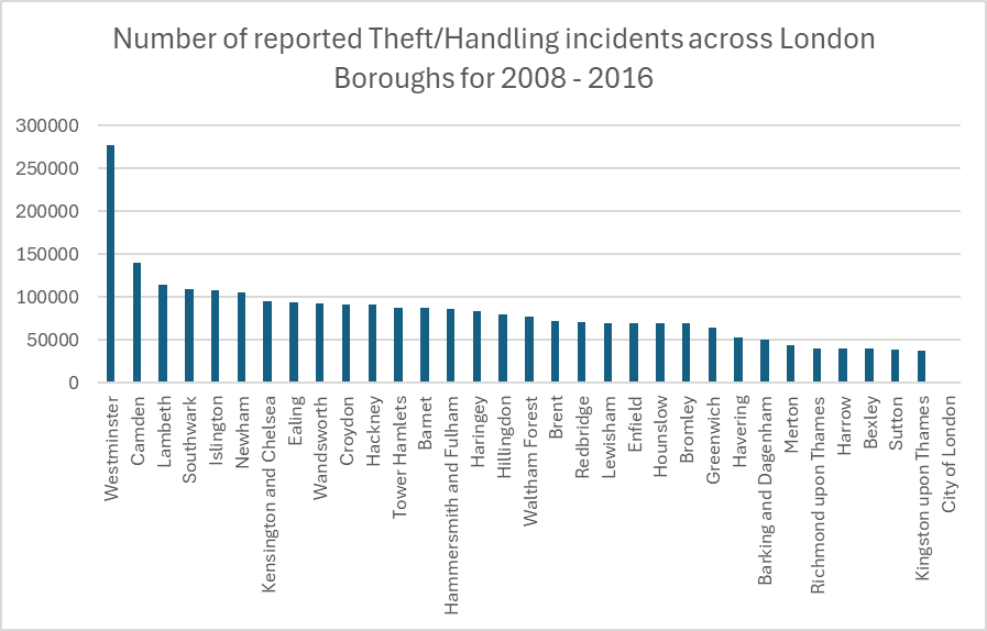
And you can see that once again, Westminster leads the way by far in this department.
Follow-up considerations:
It would be interesting to look at whether other types of crime are more prevalent in the Westminster area than in other boroughs. It was shown that Theft and Handling, which made up the majority of reported crimes in Westminster, was in fact much higher there than in the other boroughs. This might not be the only reason why Westminster is the worst borough for crime, though. It fits in with the ‘high footfall’ theory, as pickpocketing and opportunistic theft would fall in the theft/handling category.
However, the present analysis leaves a lot to be desired. Westminster was the worst borough for crime, but only in terms of reported crime incidents – it is not necessarily the place with the worst crime, it is just the place that is associated with the most reported crime incidents. It could very well be the case that other, more serious crimes are more prevalent in some of other city boroughs (e.g. rape, murder), and this is something that the present analysis does nothing to reveal. Violent and sexual offenses in Westminster were actually shown to be relatively low as a proportion of overall reported incidents. The next question would be, where are the worst kinds of crime reported in the highest levels?
Finally, as I pointed out at the start, the data is very old. It would be interesting to look at more recent statistics, to find out how our fair city is doing in terms of crime now. Have things got better or worse in the past nine years? You might say I should know, because I have been here the whole time. I am grateful to say that I have managed to get by unscathed (but should it be a surprise, you know what an introverted dork I am. Maybe I should get out more).

Leave a comment