2025-07-04
This week I got to grips with learning the ropes of the R programming language. I thought it might be instructive to play around with one of the sample datasets. I chose the economics dataset which is preloaded to the ggplot2 library.
Let’s load up the dataset, and do some exploratory analysis:
data("economics")
head(economics)
## # A tibble: 6 × 6
##   date         pce    pop psavert uempmed unemploy
##   <date>     <dbl>  <dbl>   <dbl>   <dbl>    <dbl>
## 1 1967-07-01  507. 198712    12.6     4.5     2944
## 2 1967-08-01  510. 198911    12.6     4.7     2945
## 3 1967-09-01  516. 199113    11.9     4.6     2958
## 4 1967-10-01  512. 199311    12.9     4.9     3143
## 5 1967-11-01  517. 199498    12.8     4.7     3066
## 6 1967-12-01  525. 199657    11.8     4.8     3018
I want to investigate how unemployment has changed over time. A line graph is a solid choice for looking at time series data.
ts <- ggplot(data = economics, aes(x=date, y=unemploy)) + geom_line()
mindate = min(economics$date)
maxdate = max(economics$date)

ts + labs(
  y = 'No. unemployed in thousands',
  title = 'A time series graph to show how unemployment has changed over time in the US',
  subtitle = paste('For the period ', mindate, ' - ', maxdate)
)
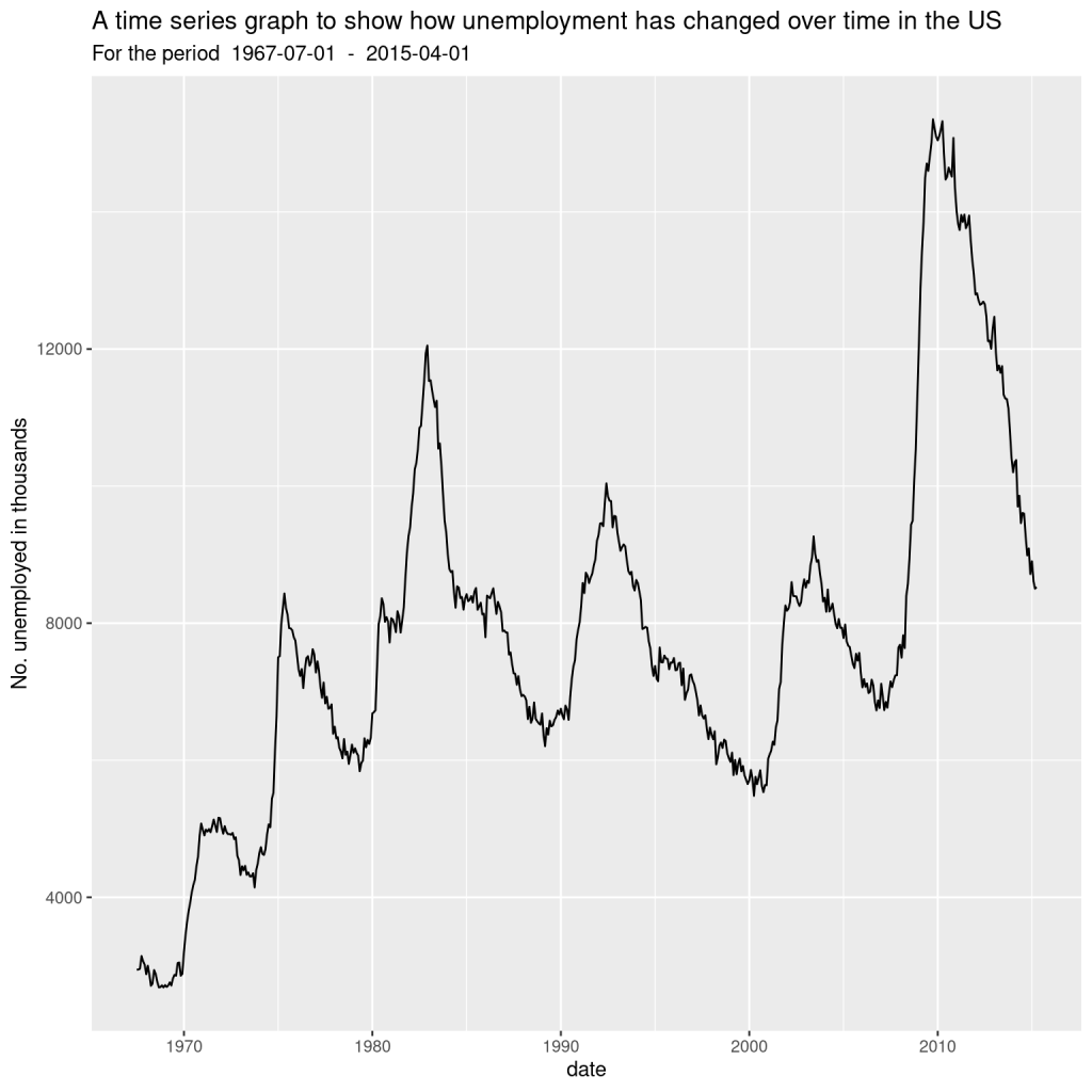
So it looks like unemployment has gone up a lot over the years. Bear in mind, however, that unemployment is quantified as a proportion of the working population, and of course the population of the US has increased a lot over time as well.
You can tell from the chart that unemployment was at its lowest some time around 1968-1969, and peaked around 2009, before falling somewhat sharply. Let’s write some code to find out precisely when the high and low points were:
min_row <- economics[which.min(economics$unemploy), ]
max_row <- economics[which.max(economics$unemploy), ]

print(min_row)
## # A tibble: 1 × 6
##   date         pce    pop psavert uempmed unemploy
##   <date>     <dbl>  <dbl>   <dbl>   <dbl>    <dbl>
## 1 1968-12-01  576. 201621    11.1     4.4     2685
print(max_row)
## # A tibble: 1 × 6
##   date         pce    pop psavert uempmed unemploy
##   <date>     <dbl>  <dbl>   <dbl>   <dbl>    <dbl>
## 1 2009-10-01 9932. 308189     5.4    18.9    15352
So, unemployment was nearly six times higher in 2009 vs 1968, while the population was only about 1.5 times higher. Interesting.
I want to investigate further the relationship between the variables in the dataset. Let’s create a new variable for the unemployment rate, defined as the proportion of unemployed people in the population at any point in time, and look at the time series for that:
library(dplyr)
##
## Attaching package: 'dplyr'
## The following objects are masked from 'package:stats':
##
##     filter, lag
## The following objects are masked from 'package:base':
##
##     intersect, setdiff, setequal, union
economics <- economics %>%
  mutate(unemploy_rate = unemploy / pop)

ggplot(data=economics, aes(x=date, y=unemploy_rate)) +
  geom_line() +
  labs( y = 'Unemployment rate (as unemployed/population)',
        title = 'A time series graph to show how the unemployment rate has changed over time in the US')
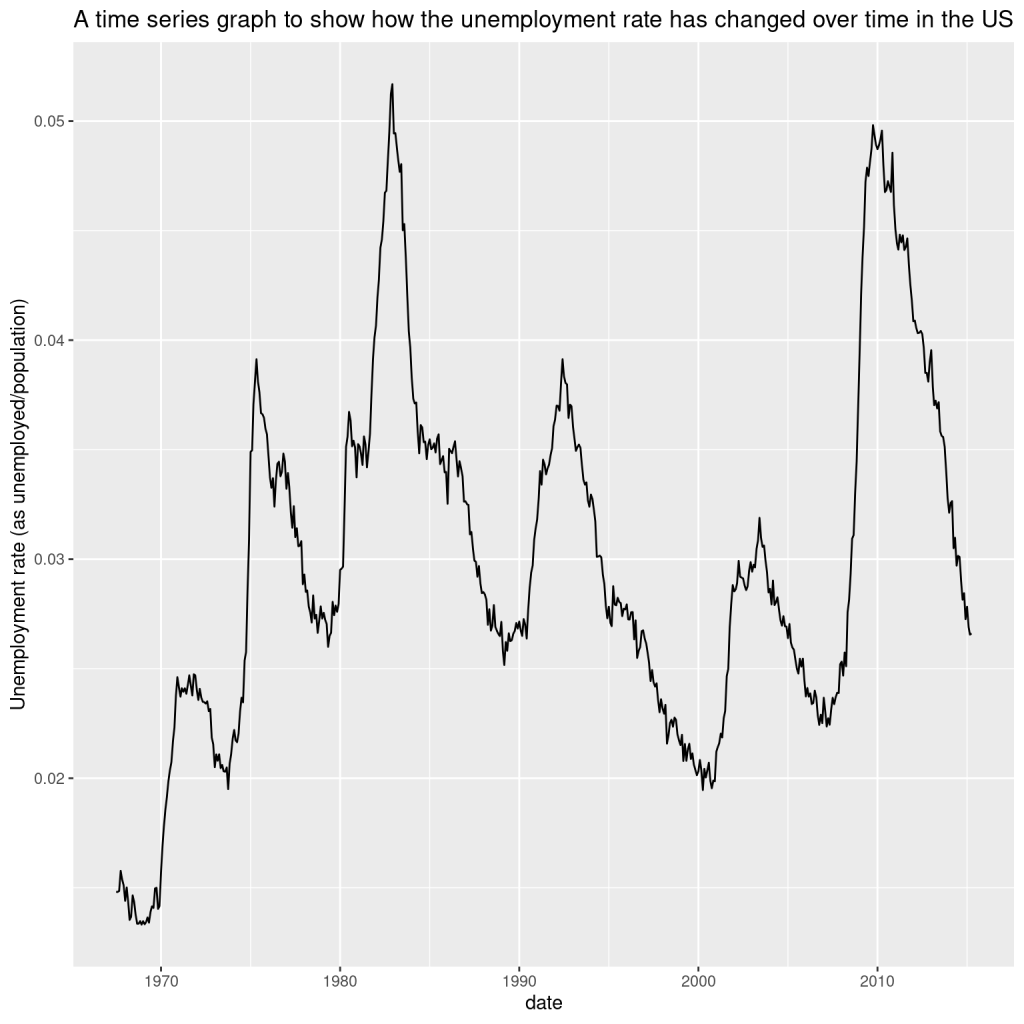
min_row_rate <- economics[which.min(economics$unemploy_rate), ]
max_row_rate <- economics[which.max(economics$unemploy_rate), ]

print(min_row_rate)
## # A tibble: 1 × 7
##   date         pce    pop psavert uempmed unemploy unemploy_rate
##   <date>     <dbl>  <dbl>   <dbl>   <dbl>    <dbl>         <dbl>
## 1 1968-12-01  576. 201621    11.1     4.4     2685        0.0133
print(max_row_rate)
## # A tibble: 1 × 7
##   date         pce    pop psavert uempmed unemploy unemploy_rate
##   <date>     <dbl>  <dbl>   <dbl>   <dbl>    <dbl>         <dbl>
## 1 1982-12-01 2162. 233160    10.9    10.2    12051        0.0517
It looks exactly the same as the previous chart! Should that have been a surprise?
Using some help from ChatGPT, I will create a plot that shows both lines on the same time series graph to investigate further:
library(tidyverse)
## ── Attaching core tidyverse packages ──────────────────────── tidyverse 2.0.0 ──
## ✔ forcats   1.0.0     ✔ stringr   1.5.0
## ✔ lubridate 1.9.2     ✔ tibble    3.2.1
## ✔ purrr     1.0.2     ✔ tidyr     1.3.0
## ✔ readr     2.1.4
## ── Conflicts ────────────────────────────────────────── tidyverse_conflicts() ──
## ✖ dplyr::filter() masks stats::filter()
## ✖ dplyr::lag()    masks stats::lag()
## ℹ Use the conflicted package (<http://conflicted.r-lib.org/>) to force all conflicts to become errors
economics <- economics %>%
  mutate(
    unemploy_rate = unemploy / pop,
    unemploy_scaled = scale(unemploy)[,1],
    rate_scaled = scale(unemploy_rate)[,1]
  )

econ_long <- economics %>%
  select(date, unemploy_scaled, rate_scaled) %>%
  pivot_longer(cols = -date, names_to = "variable", values_to = "value")

ggplot(econ_long, aes(x = date, y = value, color = variable)) +
  geom_line(size = 1) +
  labs(title = "Scaled Comparison: Unemployed Count vs. Unemployment Rate",
       y = "Standardized Value",
       color = "Variable") +
  theme_minimal()
## Warning: Using `size` aesthetic for lines was deprecated in ggplot2 3.4.0.
## ℹ Please use `linewidth` instead.
## This warning is displayed once every 8 hours.
## Call `lifecycle::last_lifecycle_warnings()` to see where this warning was
## generated.
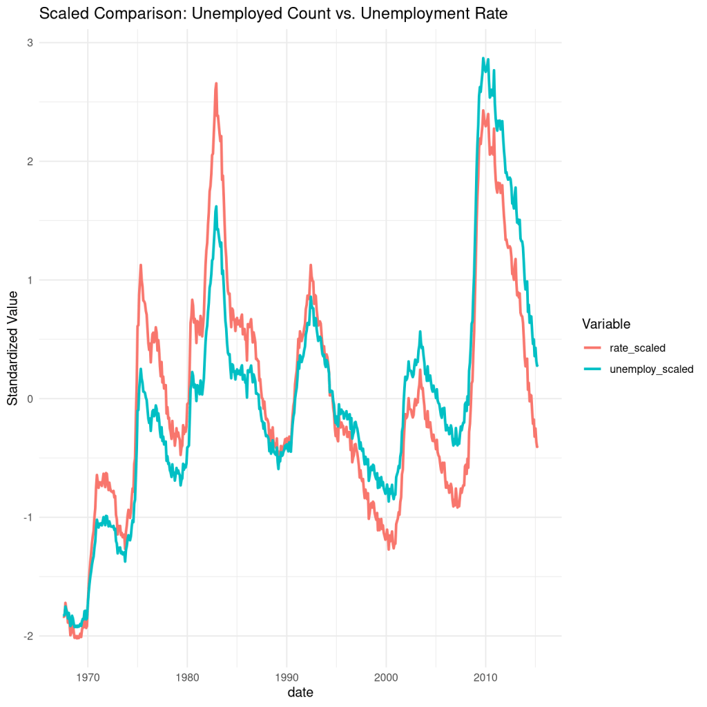
So even though the times series for the two variables have the same shape, you can see that they are not exactly the same.
The scale function is applied to both variables to make a meaningful comparison on the y-axis. It works by converting the values for each variable to z scores (so the mean for each set is 0 and the standard deviation is 1).
To finish off my analysis for today, I will create some time-series graphs for the other variables in the dataset. I had to look up what some of these were:
pce = personal consumption expenditures, essentially a measure of how much households are spending at any given point in time. It is another commonly used measure of economic health.
psavert = personal savings rate, i.e. the percentage of disposable (afer-tax) personal income that people save rather than spend
uempmed = median duration of unemployment, measured as the median number of weeks that people remained unemployed
ts_pce <- ggplot(data = economics, aes(x=date, y=pce)) + geom_line()
mindate = min(economics$date)
maxdate = max(economics$date)

ts + labs(
  y = 'Personal savings rate',
  title = 'A time series graph to show how PCE has changed over time in the US',
  subtitle = paste('For the period ', mindate, ' - ', maxdate)
)
ts_psavert <- ggplot(data = economics, aes(x=date, y=psavert)) + geom_line()
mindate = min(economics$date)
maxdate = max(economics$date)
ts + labs(
y = 'Personal consumption expenditures',
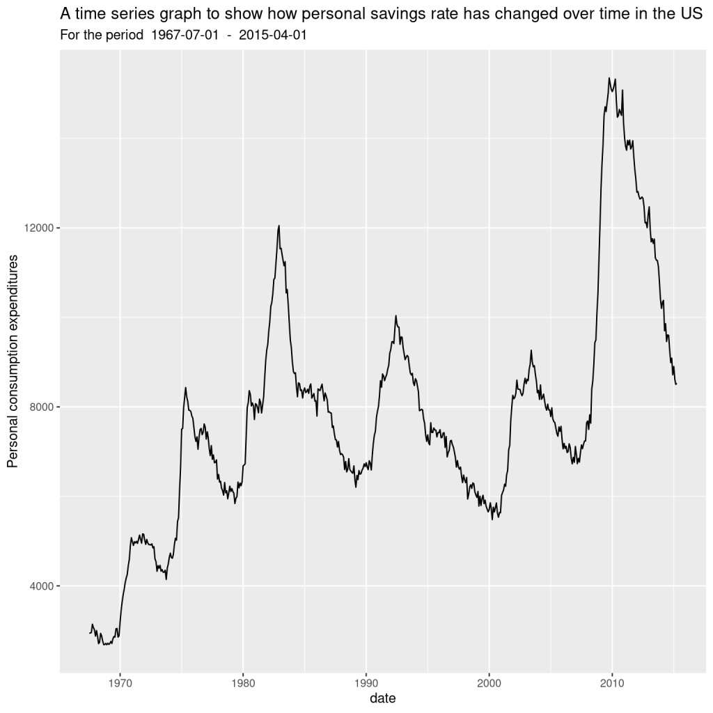
title = 'A time series graph to show how personal savings rate has changed over time in the US',
subtitle = paste('For the period ', mindate, ' - ', maxdate)
)
ts_uempmed <- ggplot(data = economics, aes(x=date, y=uempmed)) + geom_line()
mindate = min(economics$date)
maxdate = max(economics$date)

ts + labs(
  y = 'Median duration of unemployment in weeks',
  title = 'A time series graph to show how duration of unemployment has changed over time in the US',
  subtitle = paste('For the period ', mindate, ' - ', maxdate)
)
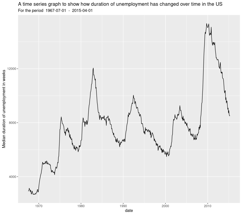
All these charts look the same! Let’s apply the method we used earlier to investigate:
library(tidyverse)

economics <- economics %>%
  mutate(
    unemploy_scaled = scale(unemploy)[,1],
    pce_scaled = scale(pce)[,1],
    psavert_scaled = scale(psavert)[,1],
    uempmed_scaled = scale(uempmed)[,1]
  )

econ_long <- economics %>%
  select(date, unemploy_scaled, pce_scaled, psavert_scaled, uempmed_scaled) %>%
  pivot_longer(cols = -date, names_to = "variable", values_to = "value")

ggplot(econ_long, aes(x = date, y = value, color = variable)) +
  geom_line(size = 1) +
  labs(title = "Scaled Comparison of the Economics Dataset variables",
       y = "Standardized Value",
       color = "Variable") +
  theme_minimal()
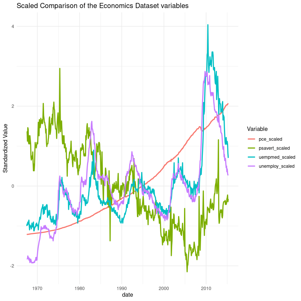
So, the scaled charts actually look very different! How about that. I was especially surprised at how the pce_scaled line turned out.
Follow-up considerations:
- The dataset points from the economics dataset only go up to 2015. How would the charts look if we had data all the way up to present date?
- The economics dataset only considers the economy of the USA. How would economic data from other countries look in comparison?
- Unemployment and other economic indicators have obviously fluctuated quite willdy over the past 50 odd years. What factors have influenced these fluctuations? Do we still see the same patterns when we look at the economic data of other countries? How can we analyse the impact of global events on nations’ economic health and stability? Can economic downturns and expansions be localized to a single nation’s economy? Could it be the case that the economic performance of some nations is more closely to specific nations than others?

Leave a comment